Aromatics
Papoutsanis
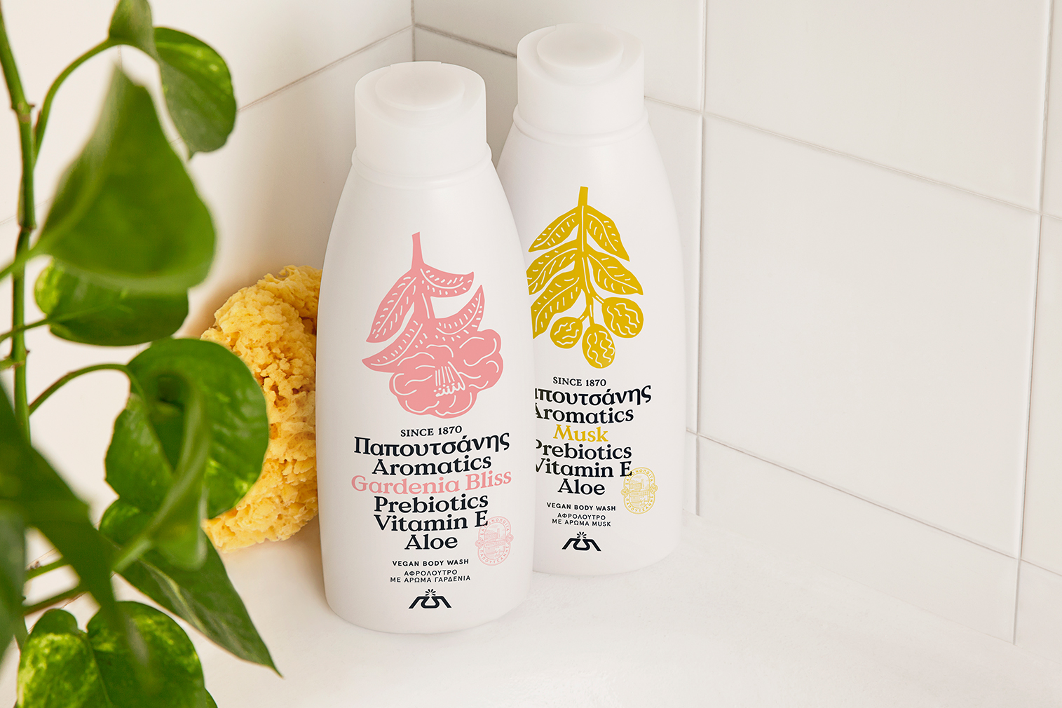
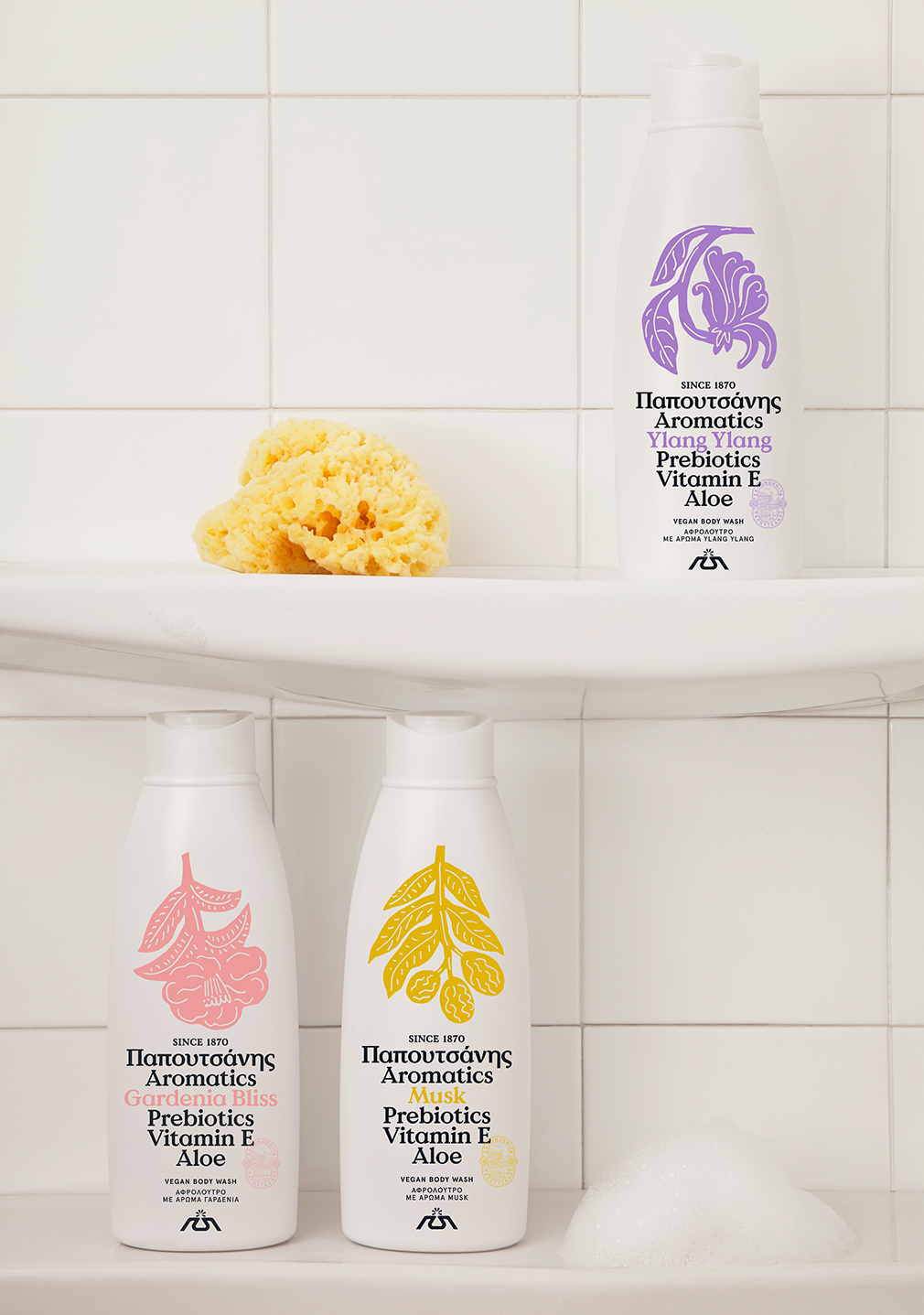
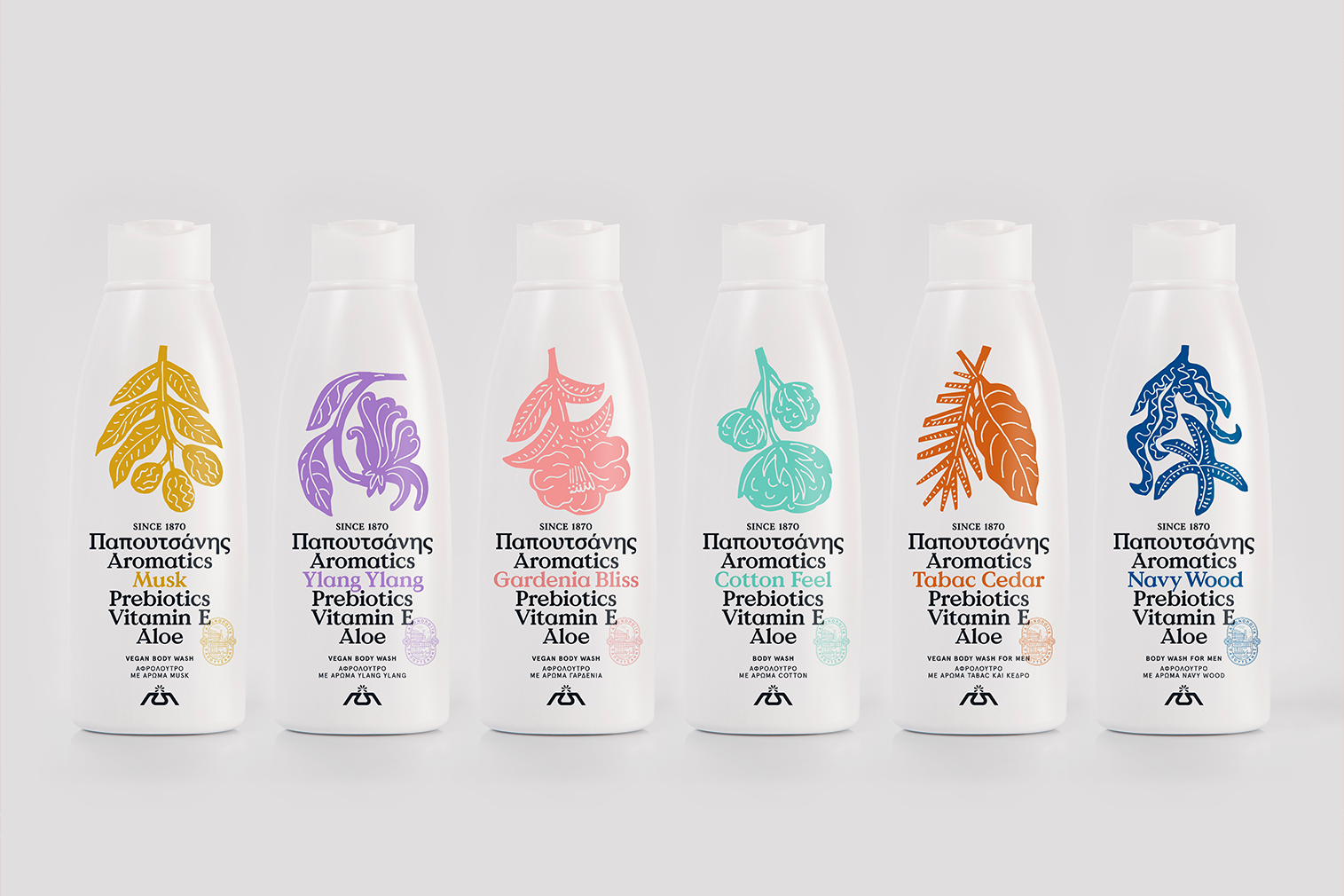
As the beauty market got competitive in recent years, the Greek household soap brand Papoutsanis invested in a systematic rebranding project, starting from its best-selling series of body washes ‘Aromatics’, loved for the variety of scents and the fair price.
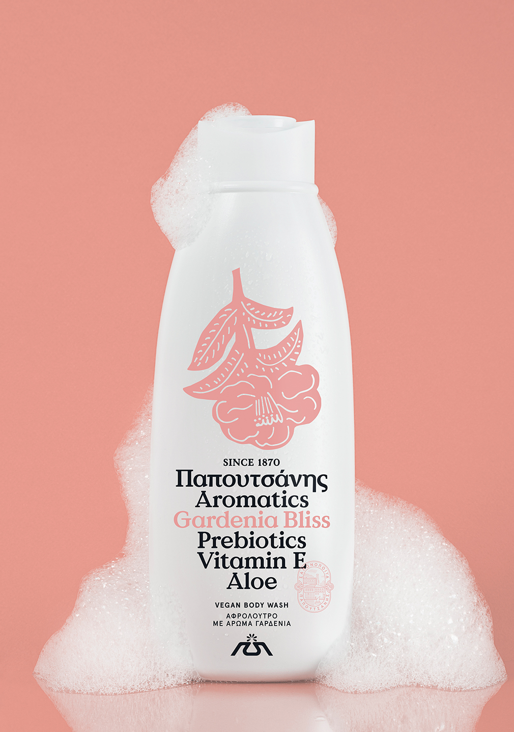
We designed a label which showcases nothing but the pure ingredients of the product. Simple, spontaneous and spot-colour illustrations represent the scents, while a clean and bold use of typography gives the composition a solid & balanced look.
The «reinvention» of the Aromatics brand was led by the need for the brand to gain strong visibility on the shelf and have a clear competitive positioning. The previous label was described by the consumers as dated, non aspirational and blunt and did not convey the purity, softness, nurturing ingredients and sensorial essence of the product.